To redesign the NPR One app around the concept of an appliance, I had one simple test in mind: does this pass the "I'm cooking in the kitchen with wet hands and not wearing my glasses" test. Here's what I came up with.
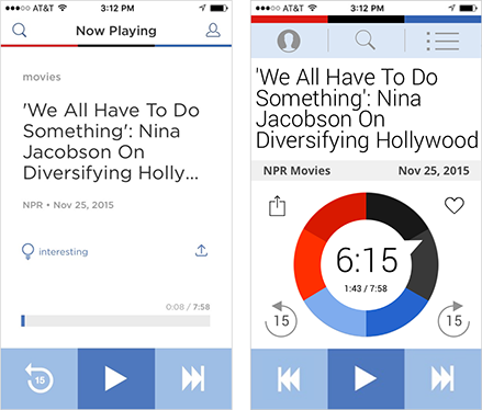
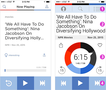
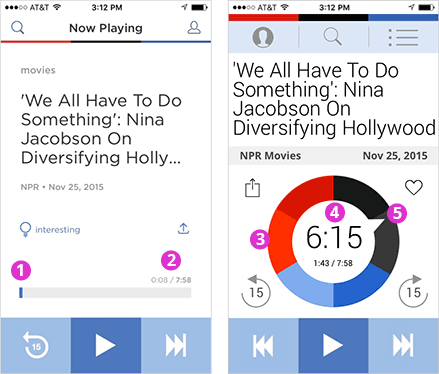
Before and After
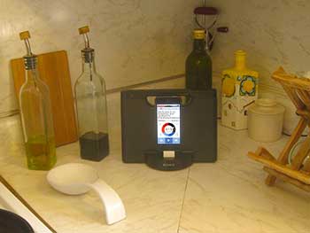
In the kitchen
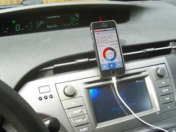
In the car
1. Structuring the Zones
Establish clear content and functionality zones:
- App controls (header)
- Headline content
- Interactivity and Status
- Primary controls (footer)
- The controls (1,4) are in blue, and form bookends.
- The content stage (2,3) is white, and framed by the bookends.
- Eye travel is minimized by corralling high-value frequently-used data to the vertical center.
- An inner hierarchy within the blue controls (1,4):
- Primary: big dark blue buttons on the bottom. Easy generous tap targets.
- Secondary: smaller light blue buttons in the header (but same easy, chunky feel)
2. Header
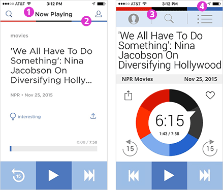
- Too floaty. These 6+ elements, above the NPR brand color bar, are just too floaty. Sure, two rows are implied in the iOS ‘breakthrough’ design, but even as minimalism goes, this is too much.
- Page-loading progress bar? Because of its positioning and thin size, I sometimes confuse this for the iOS Safari page loading progress bar. (Sometimes I swear the black bar appears to move right!) And as a branding exercise, it feels like a missed opportunity.
- Brand bar, double duty. The thick branding bar clearly sets apart the phone business versus the app business while also providing a satisfying brand presence.
- The phone bar is valuable. Setting the phone status bar apart (in stark utilitarian white) makes it a first-class citizen -- not an awkward house guest. This data is important; users reference these status indicators when using the app: “Do I have enough time, enough battery charge, and enough wifi signal for this fantastic 20-minute segment? Or should I save/heart it for later?” This phone bar looks deliberate, purposeful, valuable -- not begrudgingly bolted-on.
3. App Controls
- Primary menu. This is the primary menu as users expect. A hamburger or similar icon would be optimal, but the User icon appears here for the sake of continuity for existing users.
- Search is shifted to center. Search is crucial but doesn’t warrant a top-left corner position in the UI (where the primary icon or hamburger might go.
- My Content / My Stuff. This content tag-teams with the heart icon below to display saved or favorited items. It's a flexible junk drawer for lists of stories: Saved/hearted stories, previously heard stories, featured stories, etc. A frequently used button, it’s on the right hand side.
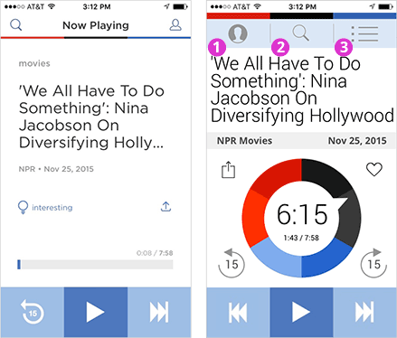
4. Headline
I often look up from cooking and glance at the headline to contextualize what I’m hearing. This is especially true for reporting styles and segments that feature an extended intro or nut graph -- where the topic or theme isn’t always immediately discernible.
- Tiny narrow gutters. Edge-to-edge letters to accommodate more characters and offset the cost of the larger font. Sure, in a print design, this zero gutter would look crowded, but it’s an appliance where utility reigns.
- Font makeover. For better usability. This font (Roboto) is full jet black (not grayscale) and larger. It’s sharp and readable from across the kitchen.
- Line height is super tight. To fully leverage the real estate.
- Narrow font. To accommodate more characters and words per line. Clipped headlines are a problem.
5. Context Bar as a Divider
Listeners mentally triangulate five context clues to decide if they want to listen to the current segment or pass and try the next segment:
- The audio they’re now hearing.
- The headline they see.
- The source of the program.
- The date.
- The story length (time).

- Framing the headline. The context bar divides the headline zone above from the audio controls below. Framing helps users to quickly orient to the app and focus on the text.
- The source is more visible. The content’s source is a major factor in helping the user contextualize what they’re hearing, e.g. when I see “On the Media” versus “TED Talks,” it changes my perception.
- The date is more visible. Being upfront with users (that some content is from the vault) helps to build the trust that curators must continually earn.
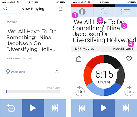
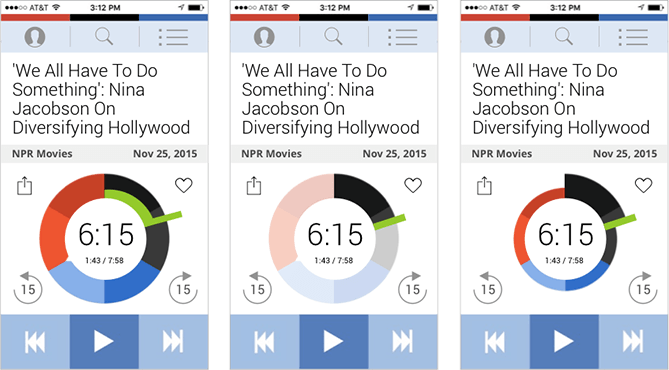
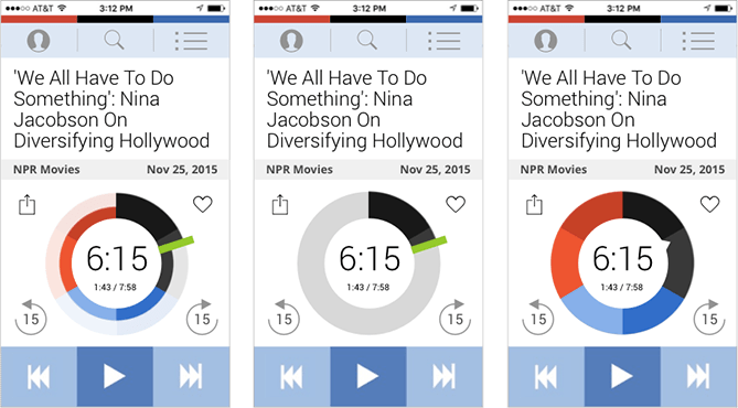
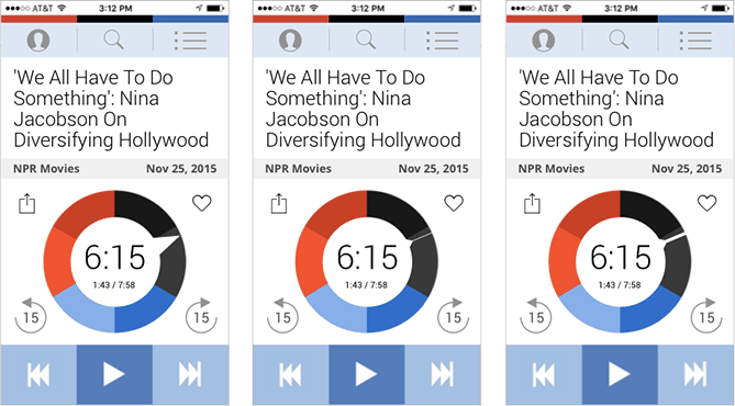
6. The NPR Story Clock
And finally, for the ta-da moment: the logo itself is inserted into the interface. Serving as a circular progress bar, the story clock deeply merges NPR, the app, and the concept of listening to audio.
Infusing the brand logo for NPR One into the interface as a core element is a massive game changer. This could ultimately become NPR’s logo and identity. NPR = audio. Audio = NPR.
- No zazz? The only time I ever really see this element is this initial state: a stationary-looking blue “i” next to a gray box. There is no joy in this visualization of the audio experience.
- Grayscale ghostly. The size, color and positioning of this text sends a signal that it’s not relevant. Yes, grayscale signals info tiers, but how light is too light?
- The NPR Story Clock is a countdown timer, indicating how much time remains for the playing segment. It’s one of the five context clues listeners use when choosing stories: Do I have time for this 30-minute segment? Or should I save/heart it for later in the car? (As a progress bar, it’s also a scrubbing tool.)
- Big chunky numbers clearly tell users how much time remains. Users instantly know what it is.
- The Moving Notch. Previously static and pointing (arbitrarily?) at the 8 o’clock position, the notch is now a dynamic progress indicator, spinning steadfastly around to the final 12 o’clock position. When at rest (and in static images), it’s pointing straight up -- at the beginning, at the ending. The alpha and the omega. Like a rocket. Power on. Here we go.
7. Interacting with Stories in Real-time
- Confusing icon. This icon looks like the Venus female gender symbol. When my brain tries to pair the Venus symbol with the nearby Mars-ish male arrow, it's distracting to me (and possibly Prince). My best guess is that it’s a lightbulb, though that has its own connotative messaging troubles. So the challenge: how to select a familiar icon for up-voting interestingness?
- Platform-specific share icon. An Android-ism?
- Native iOS share icon. Given the potential for confusion with platform icons and confusion with emojis, going native seems helpful.
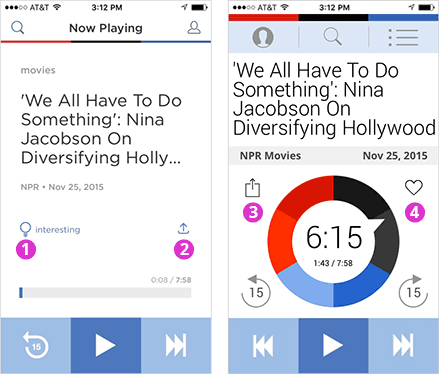
- Save / heart button. To save or bookmark stories for later. The heart is such an ideal icon. As New Yorkers will tell you, it’s more than a symbol of romantic love. It signifies approval, passion, and affinity in a way that’s both meaningful and safely generic. Even Facebook feels hemmed in by the Like button.
8. Navigation
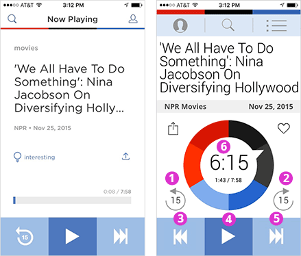
- Rewind 15 seconds. Essential for modern life.
- Fast-forward 15 seconds. When I’m in the car with the kids, I wish I had a way to skip over inappropriate content (e.g. newscasts with brief but graphic carnage reports). Otherwise, I’m forced to skip the entire segment via the Next button.
- The back button is important. The current design breaks the back button, a basic UI expectation. Some common use cases for me:
- I wanted to share the story only AFTER it ended. But now it’s too late because I can’t go 'back' to it. Maybe it’s in the history somewhere?
- When kids in the car ask to “play that again” -- but the car audio's Back/Previous button doesn’t work as expected. I can’t fiddle with the history at 65 m.p.h.
- Play and pause.
- Next story! This is the magic button. The app's latest incarnation doesn’t have a background color, but I love the huge visual tap targets here.
- Another pause button. The white circle in the Story Clock is also a pause and play button.
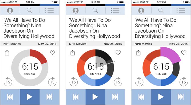
9. Early Drafts of the NPR Story Clock
This may seem surprising, but the concept of using the notch as a status indicator for the progress bar in the NPR Story Clock was not obvious to me for a long while. Maybe it was a traditional reluctance to alter an existing logo mark? In order, here are the alternative versions I explored.
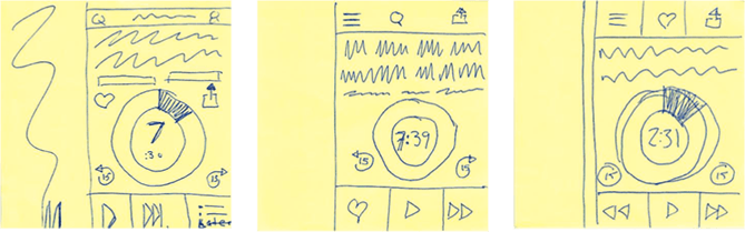
10. Initial Sketches
My first sketches, drawn on post-its on the kitchen table.